
Step 1: Create Your Kittl Account
Go to Kittl and create an account if you don’t already have one.
Kittl offers a free option, so you don’t need to purchase a paid plan just to learn how the editor works.
I’d recommend starting with the free version while you’re learning.
This gives you an opportunity to explore the interface, create some designs and decide whether Kittl suits the type of work you want to produce.
You can always upgrade later if you find yourself needing paid features.
My beginner tip
Don’t spend too much time exploring every menu when you first sign in. It’s very easy to start clicking through templates, AI tools, graphics and effects and forget that you originally came there to create something.
Pick one small project and learn the tools you need to complete it.
Step 2: Start a New Project
Once you’re inside Kittl, it’s time to create your first design.
You’ll generally have two choices: start with a template or create something from scratch.
Start with a template
Templates are useful because much of the design work has already been done for you. You can replace the wording, colours, images and other elements to create your own version.
Or start with a blank canvas
For this beginner tutorial, I recommend starting with a blank canvas.
Why?
Because starting from scratch helps you learn where the basic tools are and how the Kittl editor actually works. Instead of simply changing an existing template, you’ll understand how the different parts of a design come together.
That’s how I’d approach your first Guide Into Place graphic too: keep the project simple and concentrate on learning the basic tools.
My beginner tip
Don’t worry about creating something perfect on your first attempt.
Your first design is really about learning where things are. Once you know how to add text, change colours, insert graphics and move elements around the canvas, creating your next design becomes much easier.
Next: Choose the right canvas size for your design.
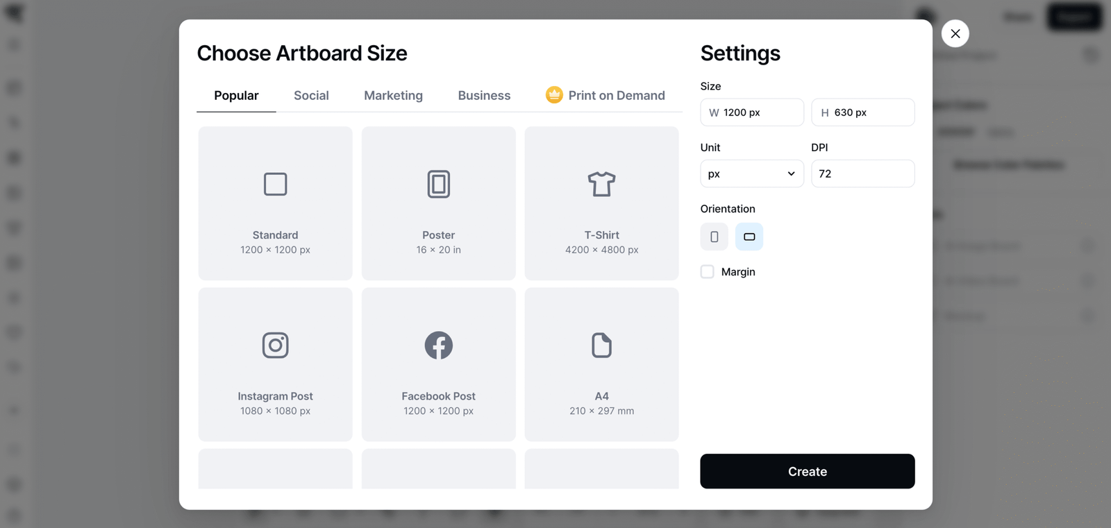
Step 3: Choose Your Design Size
Before you start adding text and images, decide how large your finished design needs to be.
The right dimensions depend on where you’re planning to use the graphic.
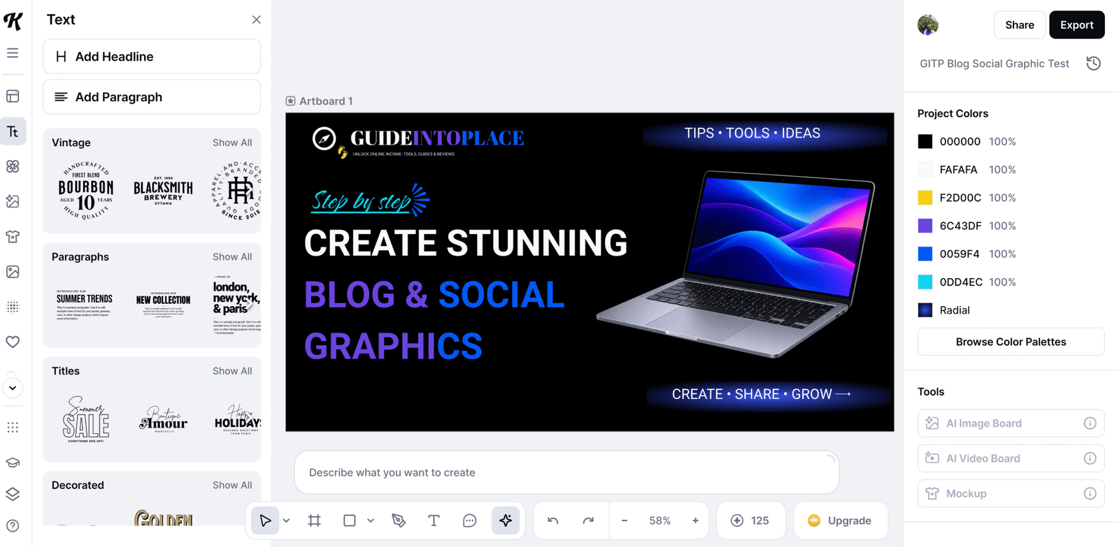
For my first Kittl design, I used:
1200 × 630 pixels
This is a useful size for many website and social-sharing graphics, and it gives you plenty of room to experiment with your design.
Kittl also lets you create custom-sized designs, which I found useful because you’re not forced to find a template with exactly the dimensions you need.
My beginner tip
Decide where you’re going to use the graphic before you start designing it.
Otherwise, you could spend time creating something you’re happy with only to discover later that it doesn’t fit the space where you intended to use it.
Step 4: Choose a Background
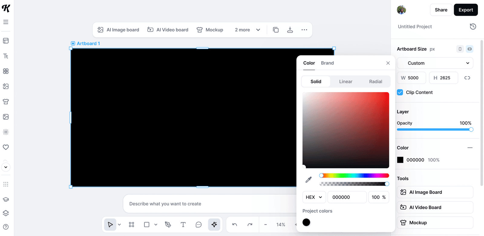
Now that you have your blank canvas, it’s time to choose a background.
For your first design, I’d keep this simple.
You could use:
- A solid colour
- A photograph
- A subtle graphic
- A simple textured background
Try not to make the background too busy. Your headline and main image should remain easy to see.
If you’re creating graphics for a website or business, this is also a good opportunity to start using colours that match your existing branding.
Keep it simple
One thing I’m learning when creating website graphics is that simple often works better than complicated.
You can always experiment with textures, effects and more elaborate backgrounds later.
For your first design, concentrate on making everything clear and easy to read.
My beginner tip
If you’re unsure about your background, start with a plain colour.
It’s much easier to build a clean design on a simple background and add more detail later than it is to rescue a design that’s already too busy.
Step 5: Add Your Main Heading
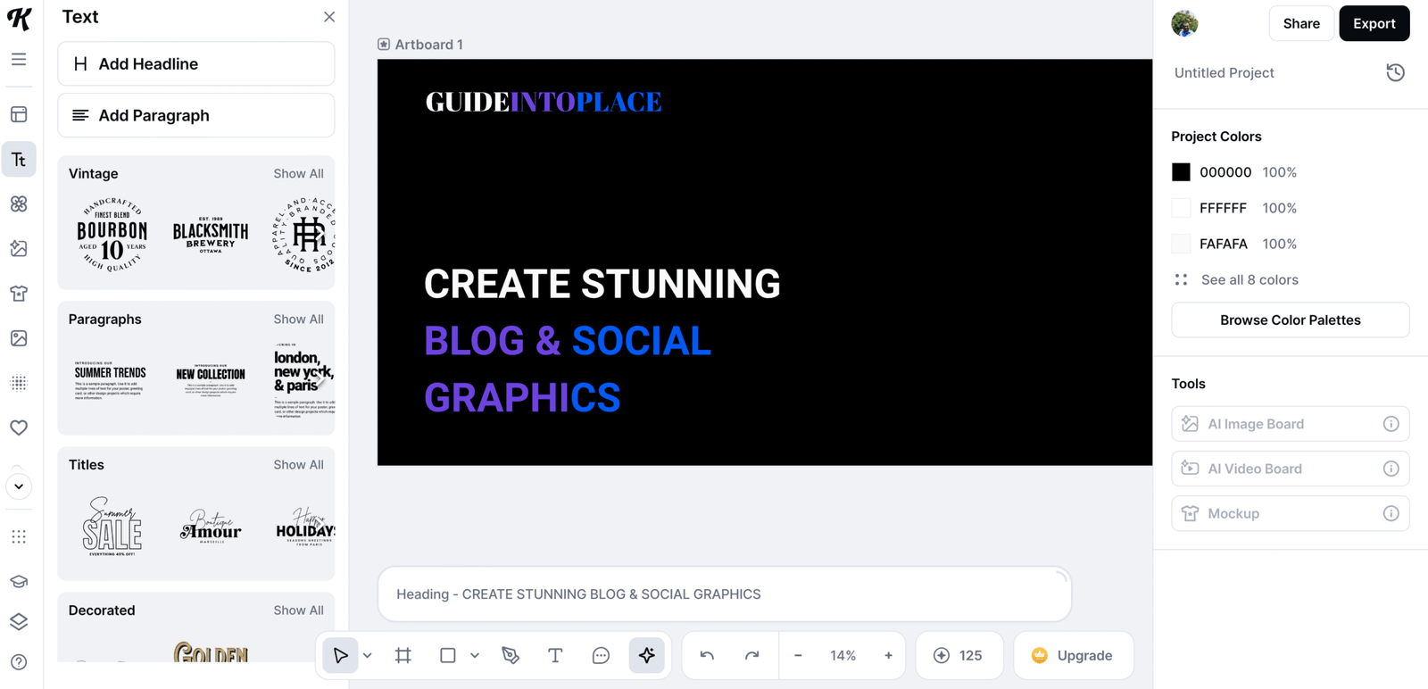
Now let’s add some text.
Start with one clear headline that explains what your graphic is about.
For example:
How to Start an Online Business
or
Beginner’s Guide to Building Your First Website
Once you’ve added your text, experiment with Kittl’s typography controls.
Depending on the options available, you can adjust things such as:
- Font
- Size
- Colour
- Position
- Alignment
- Spacing
- Text effects
Typography is one of the areas where Kittl particularly caught my attention. There are plenty of creative options available.
But don’t feel you need to use all of them.
My beginner tip
Use one or two fonts, rather than trying to squeeze five different fonts into one design.
Your headline’s main job is to communicate your message clearly.
You can experiment with more elaborate typography once you’re comfortable with the basics.
Step 6: Add an Image or Graphic
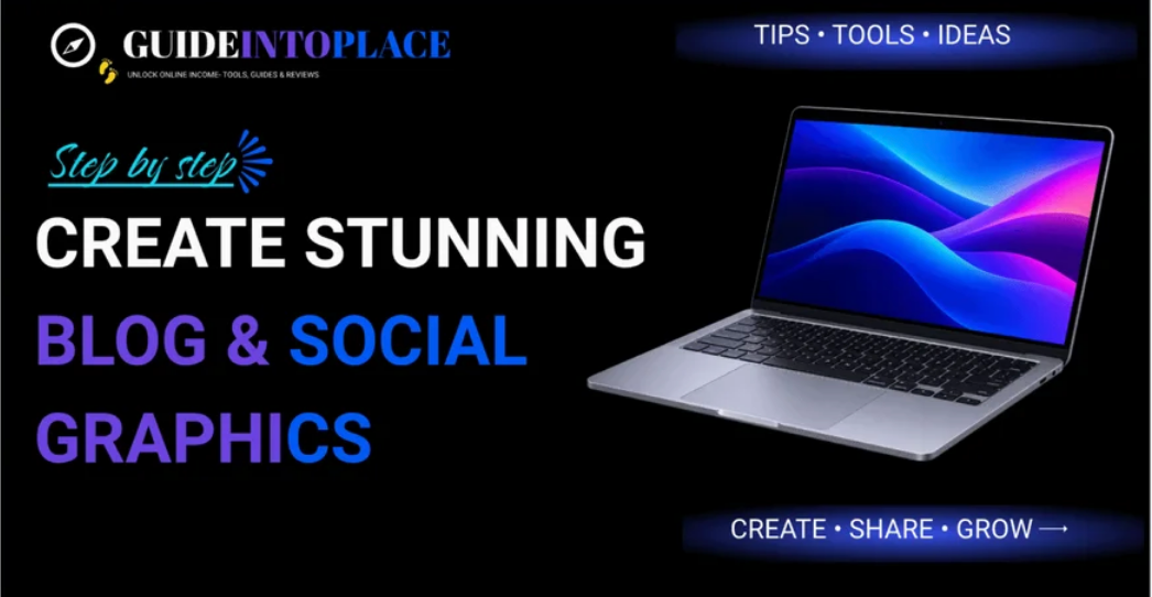
Next, add the main visual element to your design.
Depending on what you’re creating, this might be:
- A photograph
- An illustration
- An icon
- A graphic element
- One of Kittl’s available design elements
Once the image is on your canvas, move and resize it until the layout starts to feel balanced.
This was one of the points where Kittl began feeling more intuitive to me.
Instead of trying to understand every available control, I concentrated on a very simple process:
Move → Resize → Position → Check
If something didn’t look right, I moved it again.
There’s nothing wrong with experimenting. In fact, that’s probably one of the quickest ways to learn how the editor works.
My beginner tip
Don’t worry about getting the image position perfect immediately.
Get your main elements onto the canvas first. Once you can see the headline, image and background together, it’s much easier to decide where everything should go.
Step 7: Adjust Your Colours
Once your main elements are in place, take a look at the overall colour scheme.
Try to keep your design to a relatively small number of colours.
If you’re creating graphics for a website or business, using your existing brand colours can make your content more recognisable.
For Guide Into Place, for example, I try to keep the colours reasonably consistent with the rest of the website so that different graphics still feel as though they belong together.
A simple colour formula
You don’t need a professional branding system when you’re starting.
Something as simple as:
1 main colour + 1 accent colour + neutral colours
can make your designs feel much more coordinated.
My beginner tip
If you’re constantly adding colours because the design feels like something is missing, try doing the opposite.
Remove one.
A smaller colour palette can often make a beginner design look much more polished.
Step 8: Arrange Your Design
Now it’s time to bring everything together.
Move your headline, image and other elements around until the design feels balanced.
Ask yourself:
- Is the headline easy to read?
- Is the main image large enough?
- Is there enough space around the elements?
- Is anything unnecessarily distracting?
- Can someone understand the graphic quickly?
One mistake that’s easy to make when you’re learning design is trying to fill every empty space.
You don’t have to.
Empty space can actually make a design easier to understand.
My beginner tip
If you’re unsure whether something belongs in the design, try removing it.
Look at the design again.
If you don’t miss it, you probably didn’t need it.
Step 9: Add Your Branding
If you’re creating content for your website or business, this is a good time to add some subtle branding.
That might include:
- Your website name
- Your logo
- Brand colours
- Your website address
- Consistent typography
The important word here is subtle.
Your logo doesn’t need to dominate the graphic. The content itself should remain the main focus.
For my own design, I added Guide Into Place branding so that the graphic could still be associated with the website if it was shared elsewhere.
My beginner tip
Think of branding as a signature rather than an advertisement.
You want people to recognise where the graphic came from without your logo becoming the biggest thing on the page.
Step 10: Check Your Design Before Exporting
You’re almost finished, but don’t immediately hit the download button.
Take a minute to look at the complete design.
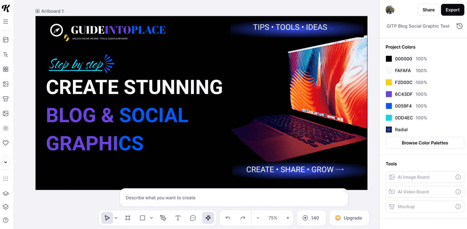
What’s wrong with the image above?
The right-hand side feels empty.
Our laptop image is missing, leaving the design unbalanced with most of the visual weight on the left.
This is exactly why it’s worth checking your design before exporting.
Check the following:
Missing images or elements
Check the spelling
Read every piece of text carefully.
A beautiful graphic with a spelling mistake suddenly doesn’t look quite so beautiful.
Check the alignment
Make sure elements that are supposed to line up actually do.
Check readability
Can you easily read the headline?
Try looking at the design at a smaller size as well.
Check the contrast
Does your text stand out clearly against the background?
Check the dimensions
Make sure you’re still working at the correct size for where you’re going to use the finished image.
Check your branding
If appropriate, make sure your website name, logo or other branding is included.
My beginner tip
Don’t just check whether everything is technically there. Step back and look at the design as a whole.
If one side feels much heavier than the other, move, resize or add an element until the design feels balanced.
And importantly, don’t make the first image perfect. The mistake is the lesson. 👍
Step 11: Download Your Design
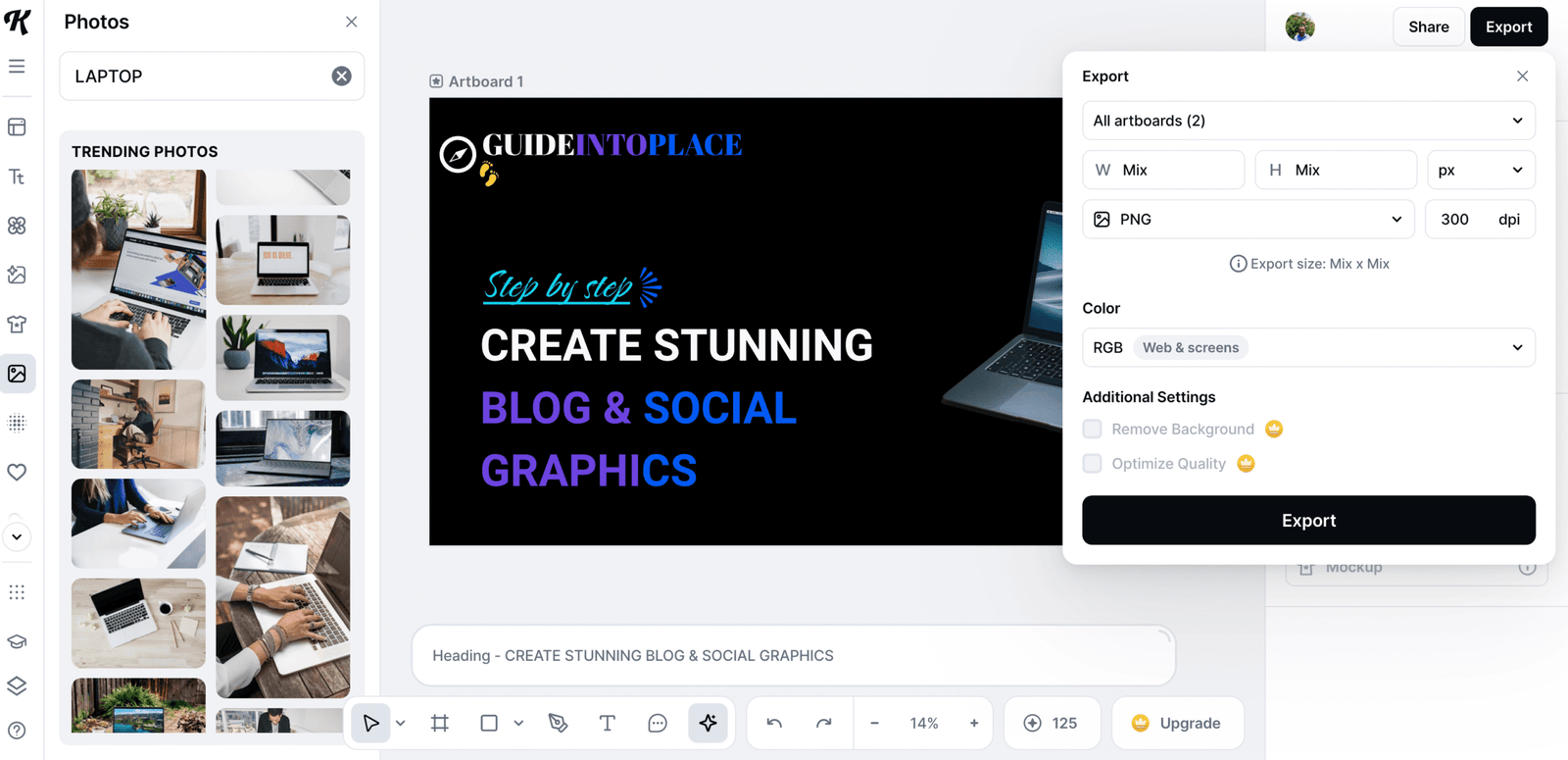
Once you’re happy with everything, you’re ready to export your design.
Your available download options will depend partly on the Kittl plan you’re using.
This is where I noticed one of the limitations of the free version.
While experimenting with Kittl Free, I found the selection of available elements more restricted than I would ideally like, and transparent-background downloads weren’t included in the free option I was using.
That doesn’t prevent you from learning Kittl or creating useful designs.
However, if you start using Kittl regularly, these are the sorts of limitations that could eventually make a paid plan more attractive.
My beginner tip
I wouldn’t upgrade simply because Kittl offers you the option.
Instead:
Start free → create some designs → discover which limitations actually affect you → then decide whether upgrading makes sense.
That way you’re paying for features you know you’ll use rather than features you think you might use.
My Experience Creating My First Kittl Design
I had almost no previous Kittl experience when I started.
Initially, the editor looked busy. There were plenty of menus, options and tools, and I wasn’t immediately sure where everything was.
Instead of trying to learn the entire platform, I created a blank 1200 × 630 canvas and concentrated on completing one graphic.
I added an image.
I added headings.
I changed the colours.
I moved elements around.
I added Guide Into Place branding.
And eventually I had a finished graphic that I was happy enough to use.
That taught me something important about Kittl:
You don’t need to master Kittl before you can create something useful.
After some experimenting, the editor started feeling much more intuitive.
There are still plenty of Kittl features I haven’t explored properly, but that’s fine.
I’ll learn them when I actually need them.
7 Kittl Tips I Wish I’d Known Before Starting
1. Don’t try to learn everything
Learn the tools required for the design you’re currently creating.
2. Start with something simple
A blog or social graphic is easier than attempting an elaborate design for your first project.
3. Know your dimensions first
Work out where you’ll use the graphic before choosing your canvas size.
4. Don’t use too many fonts
One or two is normally enough.
5. Leave some empty space
You don’t need to fill every part of the canvas.
6. Experiment
Moving things around and trying different ideas is part of learning design.
7. Start with the free version
Learn the platform first. Then you’ll have a much better idea whether the paid features are actually useful to you.
Is Kittl Easy for Beginners?
I’d describe Kittl as beginner-friendly with a small learning curve.
It wasn’t a case of opening the editor and immediately knowing where everything was.
I had to experiment.
But I didn’t need professional graphic design experience either.
Once I stopped worrying about all the tools I didn’t understand and concentrated on the few I actually needed, things became considerably easier.
Beginner Ease-of-Use Rating
4.5/5 — ★★★★☆
My verdict: Very good for beginners who are prepared to spend a little time exploring the editor.
Frequently Asked Questions
✅ Is Kittl good for complete beginners?
Yes. Based on my experience, beginners can start creating without understanding all of Kittl’s tools. There is a small learning curve, but concentrating on the basic functions makes the editor much easier to learn.
✅ Do I need graphic design experience to use Kittl?
No. I started with almost no previous Kittl experience and was able to create a finished graphic by concentrating on basic tools such as text, images, colours and positioning.
✅ Can I use Kittl for free?
Kittl offers a free option that lets you explore the platform and start creating designs. Some content, features and export options are restricted compared with the paid plans.
✅ Should beginners use templates or start from scratch?
Both are useful. Templates are faster, but I’d recommend creating at least one simple design from scratch because it helps you understand how the Kittl editor works.
✅ Can I create blog graphics with Kittl?
Yes. Blog and website graphics are one of the reasons I started experimenting with Kittl. Being able to create custom-sized designs is particularly useful for website owners.
✅ Can I create social media graphics with Kittl?
Yes. You can create graphics for social posts and promotional content and customise the dimensions for where you plan to publish them.
✅ Does Kittl have AI tools?
Yes. Kittl includes AI-assisted creative tools alongside its standard design editor. Beginners don’t need to use the AI features to start creating, however.
✅ Is Kittl worth paying for?
That depends on how frequently you use it and which features you need. I’d recommend learning with the free version first and considering an upgrade when the free plan’s limitations start affecting the designs you want to create.
Final Thoughts
Learning Kittl doesn’t mean sitting down and studying every tool before creating anything.
Create something.
That was the approach that worked for me.
My first design wasn’t about mastering Kittl. It was about learning enough of the editor to turn a blank canvas into a finished graphic.
Once you’ve done that once, the second design becomes easier.
Then the third becomes easier again.
If you’re completely new to Kittl, my recommendation is simple:
Start with a free account, choose one straightforward project and learn as you create.
Ready for the next step? Learn how to create consistent, professional blog graphics with Kittl.
Ready to Try Kittl?
You can start experimenting with Kittl for free and create your first design before deciding whether you need any of the paid features.